Jak na to - Zarovnat obrázky vedle sebe
Naučte se zarovnávat obrázky vedle sebe pomocí CSS.
Galerie obrázků vedle sebe


Jak umístit obrázky vedle sebe
Krok 1) Přidejte HTML:
Příklad
<div class="row">
<div class="column">
<img
src="img_snow.jpg" alt="Snow" style="width:100%">
</div>
<div class="column">
<img src="img_forest.jpg"
alt="Forest" style="width:100%">
</div>
<div
class="column">
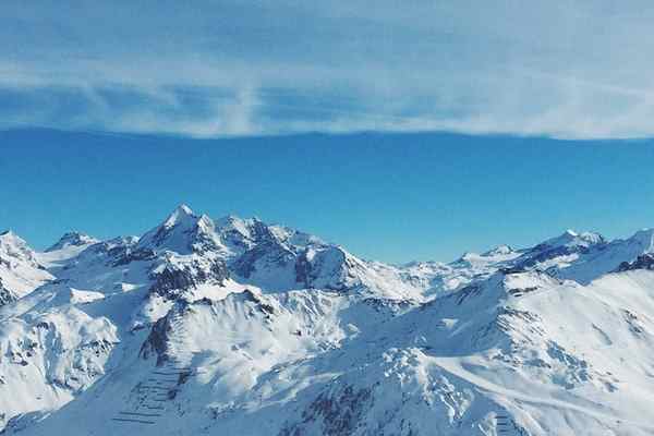
<img src="img_mountains.jpg"
alt="Mountains" style="width:100%">
</div>
</div>
Krok 2) Přidejte CSS:
Jak vytvořit obrázky vedle sebe pomocí vlastnosti CSS float:
Příklad plováku
/* Three image containers (use 25% for four, and 50% for two, etc) */
.column {
float: left;
width: 33.33%;
padding:
5px;
}
/* Clear floats after image containers */
.row::after {
content: "";
clear: both;
display: table;
}
Jak vytvořit obrázky vedle sebe pomocí vlastnosti CSS flex:
Příklad Flexbox
.row {
display: flex;
}
.column {
flex: 33.33%;
padding:
5px;
}
Note: Flexbox is not supported in Internet Explorer 10 and earlier versions. It is up to you if you want to use floats or flex to create a three-column layout. However, if you need support for IE10 and down, you should use float.
Tip: To learn more about the Flexible Box Layout Module, read our CSS Flexbox chapter.
Add Responsiveness
Optionally, you could add media queries to make the images stack on top of each other instead of floating next to each other, on a specific screen width.
The following example will stack the images vertically on screens that are 500px wide or less:
Responsive Example
/* Responsive layout - makes the three columns stack on top of each other
instead of next to each other */
@media screen and (max-width: 500px) {
.column {
width: 100%;
}
}
To learn more about media queries, read our CSS Media Queries Tutorial.
Related Pages
To learn more about how to style images, read our CSS Images Tutorial.
To learn more about CSS Float, read our CSS Float Tutorial.
To learn how to create an image gallery with CSS, read our CSS Image Gallery Tutorial.